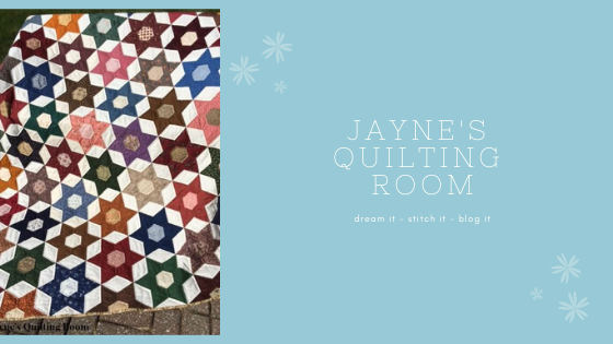
OMG!!! I am certainly the slowest learner of all times. I have spent the better part of 2 hours trying to create a new look for this blog.
Finally, after playing the tutorial from Shabby Blogs for the umpteenth time, I figured it all out.
Whew.
I'd be interested in knowing how you like it. (*hinting for feeback*)
Jayne

Love the colours! And the way they look aged!
ReplyDeleteMy only little teeny suggestion is that if there's a way to reduce the "white space" at the top of the blog, that might be nice. And, perhaps, instead of trying to fit everything into your right column, you might consider using "pages". These are just minor thoughts, intended only to be helpful. I'm not such a techie myself.
I loce it! I really like the design... it's so sweet and has nice personality, if you know what I mean. Which is what you want your blog to have right? I might have to go over to Shabby blogs now and see about a make over!
ReplyDeleteLove the shabby chic look! Plus it is a nice change for spring! Also thank you for the Shabbyblog find as well.
ReplyDeleteSuper pretty!
ReplyDeleteLooks great! I especially love your header. Maybe you could give me a tutorial.
ReplyDelete